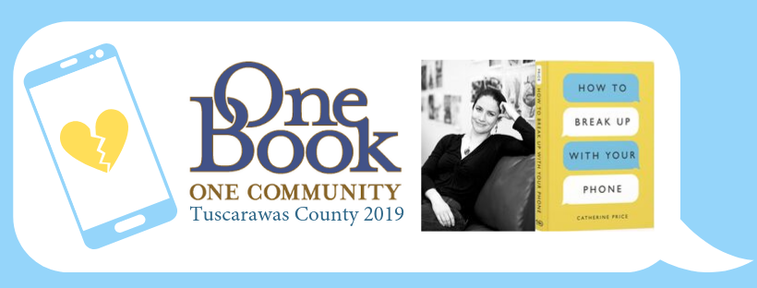
 Cover Influence Book covers are designed to catch the eye and brand the book. Good covers hook the intended audience. Good covers communicate that they are part of a series. When you are working on a graphic design project related to a book, let the cover guide your design. Adopted Elements How to break up with your phone by Catherine Price, is this years pick for the Tuscarawas County One Book One Community. The minimal bold cover design was easy to draw design elements from. I adopted the colors of yellow, light blue, white and black text, a sanserif font, all caps titles, and speech bubble motif. I repeated these elements through all the marketing materials created for One Book One Community. No matter what project you are working on, if it has multiple parts work hard to keep your design consistant so that it is instantly relatable to each other piece of branding. Good design takes time. The initial designs for the trifold brochure, 11x17 poster, 8.5x11 flyer, and bookmark took 7 hours of concentrated work. I am not sure how much time I spent on the entire project, since I was working on it intermittently for weeks. After the initial promotional materials there were the #Tuscunplugs passport, social media posts, individual event flyers, several iterations of the bookmark... And numerous edits. Can we move this information to the backside, do we have room to add these events, what if we reworded this section, can we do it in blue? Editing is what makes your designs better, so this stage is very important. Having someone be able point out problems or suggest alternatives is awesome! I used to think I didn't want to do graphic design work because I would be too sensitive about my work, but it turns out I can handle it and I appreciate the feedback. I feel like I am working through a design and communication problem and having people to puzzle over the problem with me helps. What is One Book One Community? I'll just quote the description we use in our promotional materials, specific to my county. "One Book, One Community is a grassroots reading movement that aims to bring people together by giving them a shared experience. When we all read the same book we have something to talk about. One Book One Community's goal is to break down the barriers between different groups of people and to strengthen Tuscarawas County." In my county each library sends a representative to be on the OBOC comittee. Every year the committee chooses a socially relevant book and sometimes a picture book companion to involve younger children. In 2016 I was on the comittee when we picked the Christmas Jars by Jason F. Wright. 
0 Comments
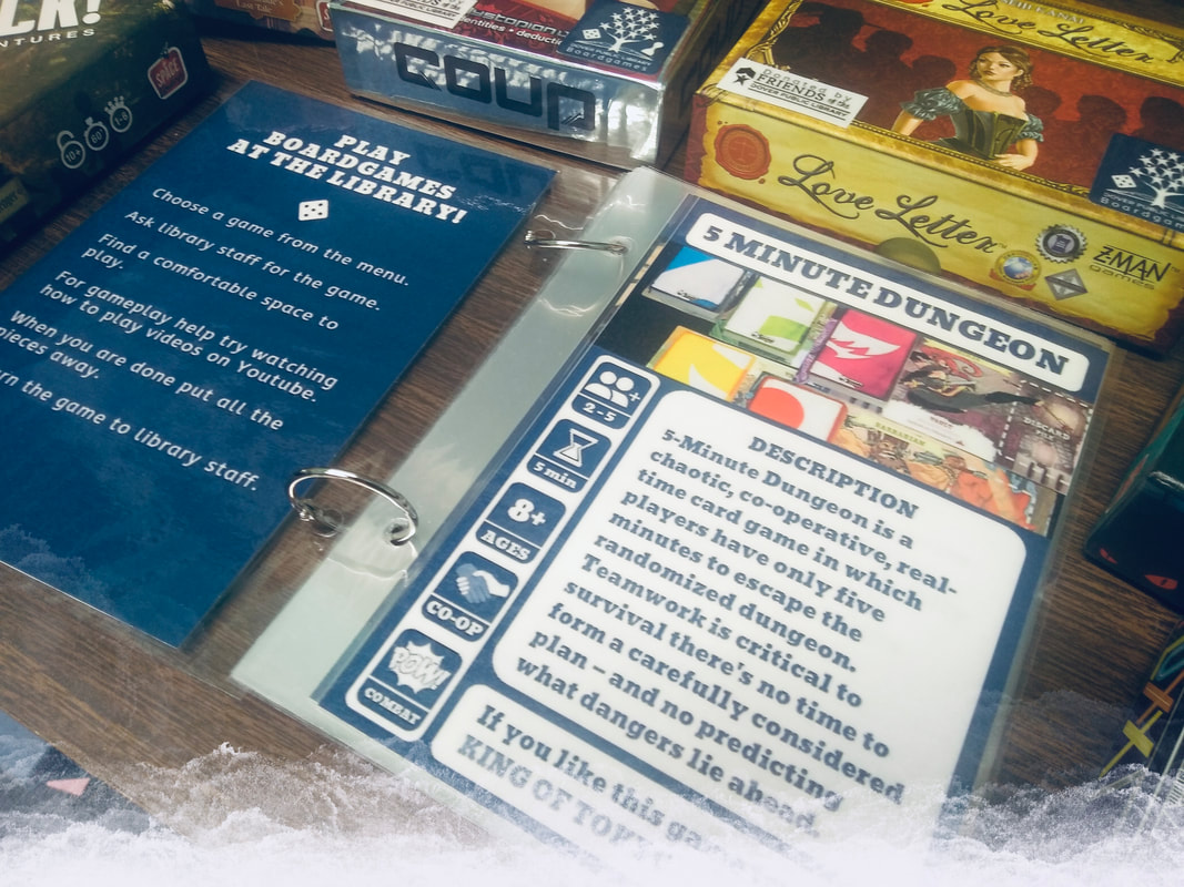
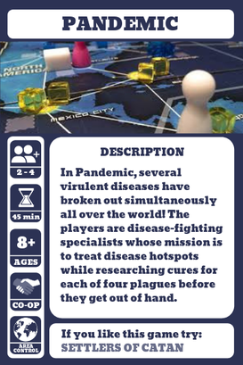
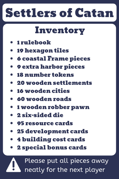
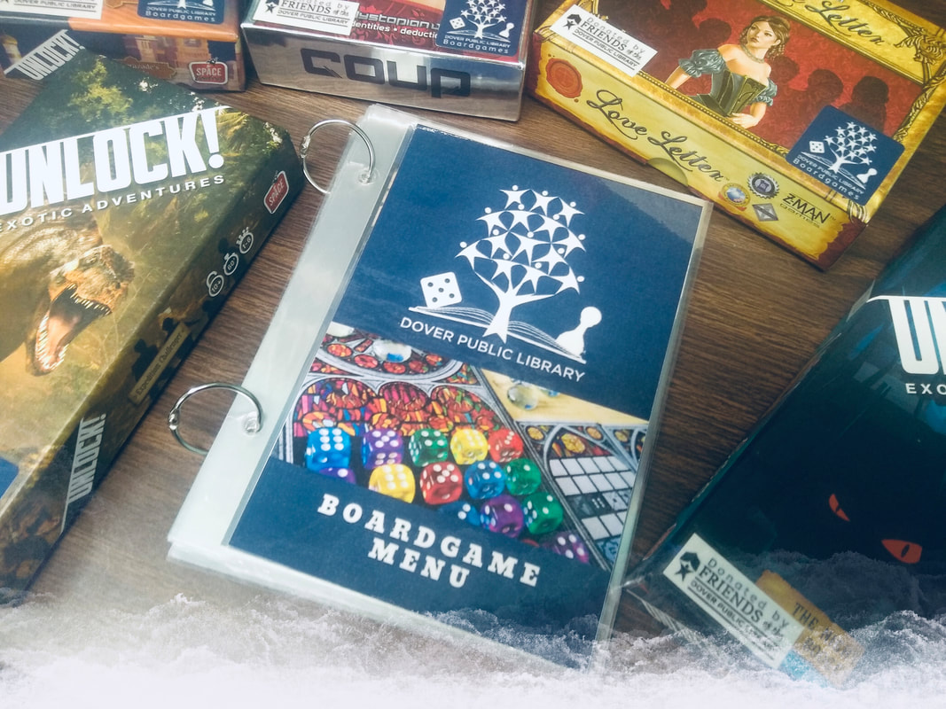 Why Board Games? Board games are amazing at bringing people together. In a time were we are often focused on our little black mirrors we sometime take for granted opportunities to engage with our friends and families. At least I know I do. So I rediscovered board games as a fun and entertaining way to set aside time for the people in my life who are important to me. Currently board games are going through a revival. Board game cafe's have become a popular meeting place. I visit Sapphire City Board Game Parlor for it's atmosphere and friendly and knowledgable staff. It is an hour away from where I live in a small town, and I wished that I could bring a taste of that experience to my community. I work at Dover Public Library that finished renovations earlier this year opening up its space to be more inviting. My first thought when I saw the large tables next to the wall of windows was, this space is perfect for playing board games. So I wrote a proposal to bring board games to the library, and it was met with overwhelming support. The Friends of the Dover Public Library donated money to purchase the initial collection and I was tasked with the acquisition and processing of materials. Selection Considerations I chose board games that would represent diverse gameplay mechanics and themes as well as variety in player count, from games that could be played solo to games that can be played by larger groups. My goal was that most of the games should be playable in 1 hour or less, though 2 longer running games did make it into the collection. I also chose games that were highly recommended and many of them are considered gateway games. I also played most of these games at Sapphire City, before purchasing them .
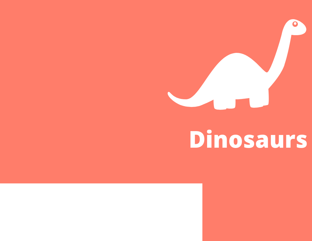
 Links to Additional Resources Here are some blog posts and websites I found helpful for starting this collection. Board in the Library series Circulating Board Game Collection 5 lessons from the library: circulating board games (one year later) Board Game Geek The Dice Tower Rahdo Runs Through Watch it Played  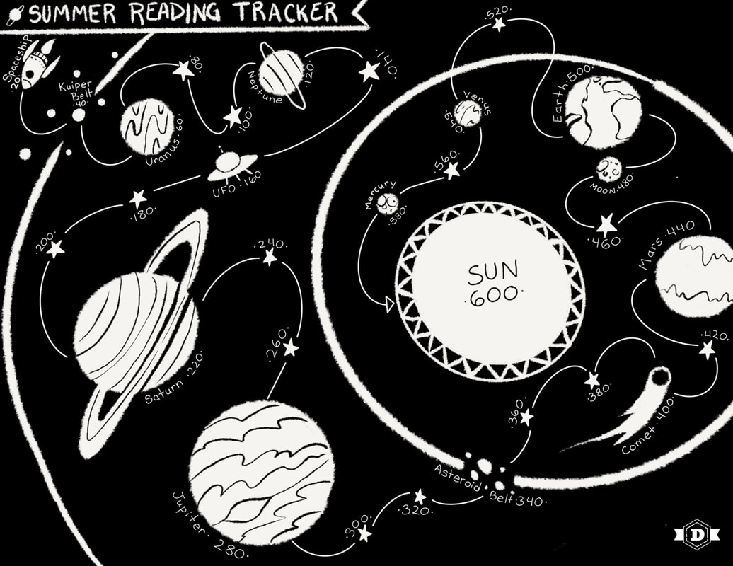 The summer reading program theme this year is Universe of Stories. Space is one of my favorite themes and this year I am super excited to transform the children's department into a star filled galaxy. To go with the theme I illustrated the summer reading tracker. We use 20 minute increments with a goal of 600 minutes (10 hours). We will print the instructions on the back side of the tracker, for kids to color in a planet or star for each increment of 20 minutes they read as they travel from the Kuiper Belt to the Sun, and include the deadline for the program. Since so many libraries are doing the Universe of Stories for their summer reading program, I thought it would be cool to share this summer reading tracker with you. You are welcome to print this reading tracker to use for your program, and as always, it is free. To save at full size right-click the image and select open image in a new tab, then save from there.  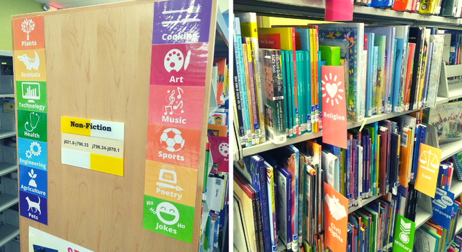 Did you ever just inwardly groan when you need to find something in the kids non-fiction section. I think it has something to do with the teeny tiny spines that make it difficult to read the call numbers, or the fact that every book is a different size and at least for my department one of the aisles is dark and spooky. Imagine what it is like for a kid to try to find something in all of that. Not fun. So in an effort to make the non-fiction section in the children's department, at Dover Public Library, navigable by young readers and non-readers I made some visual subject signs in a rainbow of colors. We tried to keep it as simple as possible and not make too many signs because that could become just as overwhelming as no signs. I also made smaller matching labels to go on the ends of the shelves.
So what happened after we added the labels? Parents point out the signs to their kids and explain, "See the picture of the dinosaur? That's where the dinosaur books are." We get fewer questions from parents and teachers about where to find books in these general areas and instead get questions on more specific topics. It has also made shelving books in the non-fiction section a lot easier, especially for adult department staff who are less familiar with where everything is in the children's department. And the colorful signs make the spooky aisle feel a little less spooky.
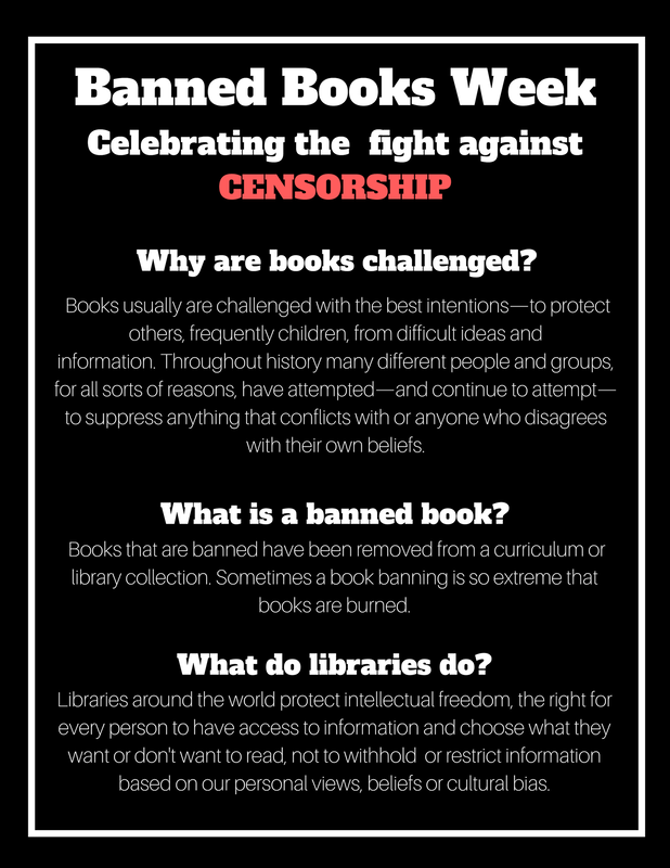
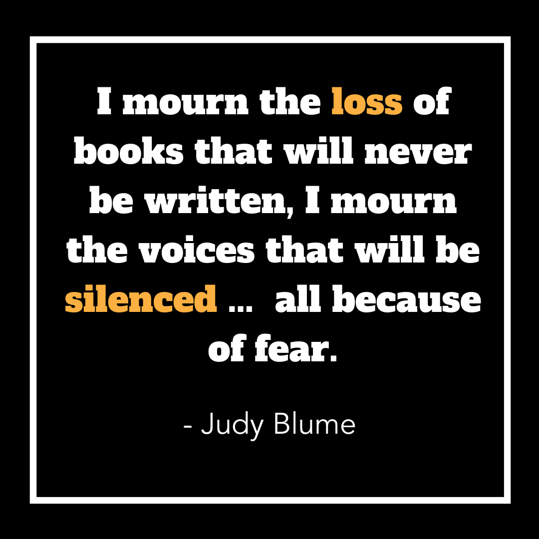
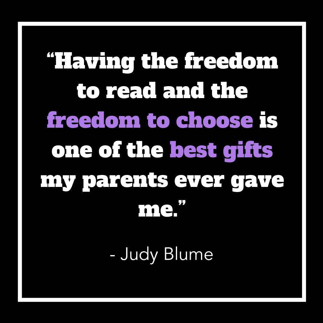
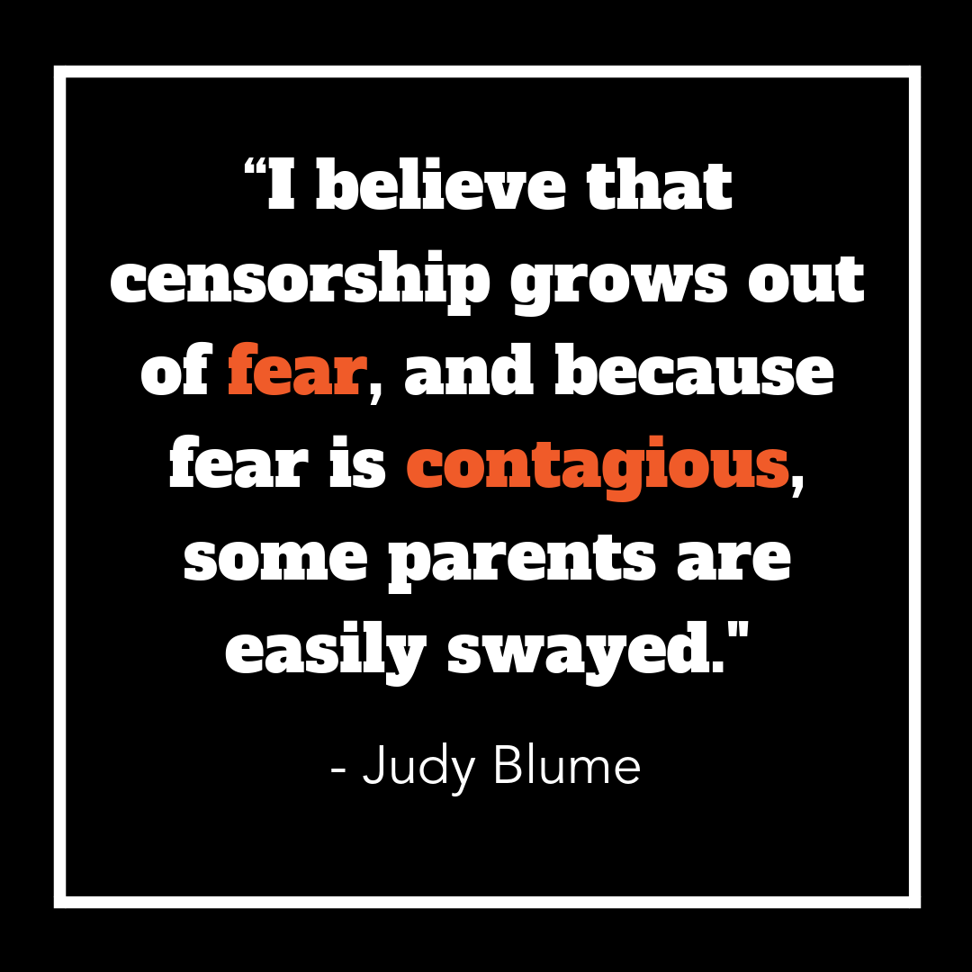
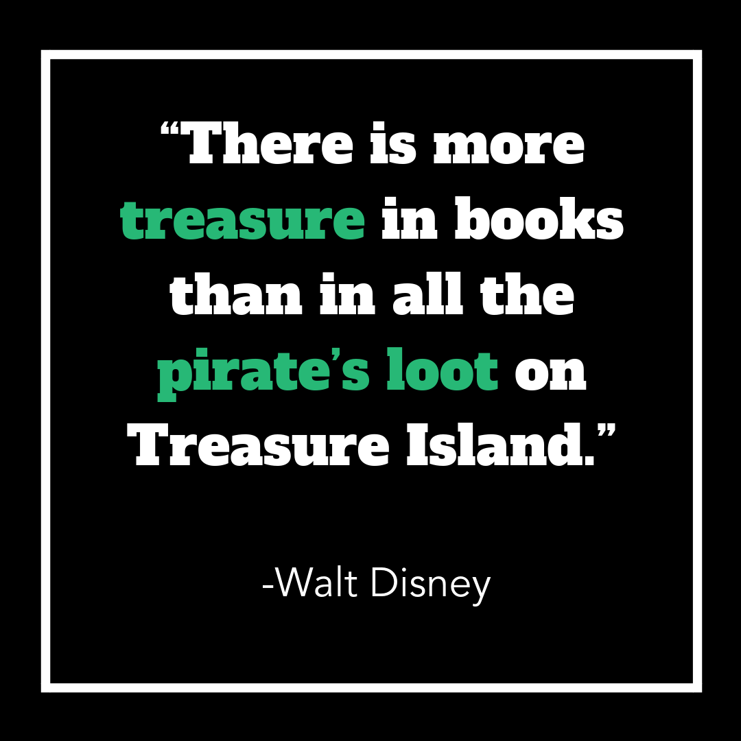
 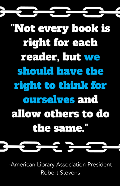 There are so many clever banned book week displays. I made these quote posters to go with our display of books in cages. I also made an info poster about what censorship is and what the library stands for. This was really important to me because many people don't know that libraries actively promote intellectual freedom and fight censorship. I actually had someone tell me they were glad a book was banned. I think they thought we were for censorship.... awkward. So with your clever book displays this year and for years to come don't forget to explain what censorship is and that the library is for intellectual freedom. The zip file includes 1 large quote poster, 1 info poster and 8 mini quotes also appropriately sized for sharing on social media.
 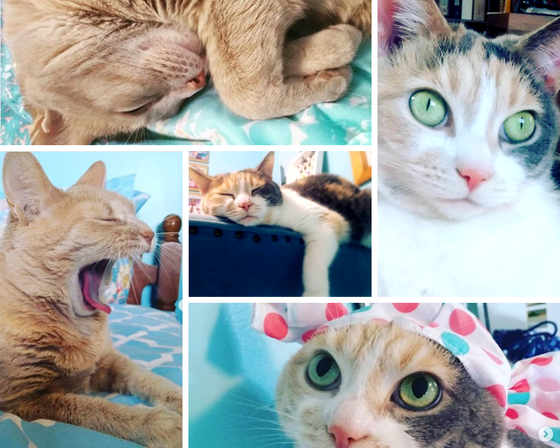 Photo grids are so cool! Photo grids can be a great way to feature photos on your library's social media and website. They allow you to organize your pictures in fun and entertaining ways, and they are so easy to make on Canva. They have lots of options with a combination of different sized photo spots to form your grid, then all you need to do is upload your photos and drag them into one of the spots and they automatically snap in place. Photos will automatically be centered and cropped to fit the grid. You can double click a photo to adjust it, slide it around and stretch it to fit the way you want. You can also add other graphic elements and text on top. Let me show off this cool grid I made of my cats, Carmello and Custard. 
My library recently renovated the Adult, Teen, and Technical Service departments. It was a huge undertaking with beautiful results and really changed the face of the library. We were able to update wiring and change the flow of traffic, as well as make the environment more welcoming and attractive. We moved our front desk, opened up one side of the library for social and reading spaces and added a cozy fireplace. Honestly the fireplace is my favorite addition. I like that while we updated the environment, we didn't sterilize it into feeling like an Apple store. We really wanted it to be cozy and inviting. There is a lot of wood, and earthy colors.
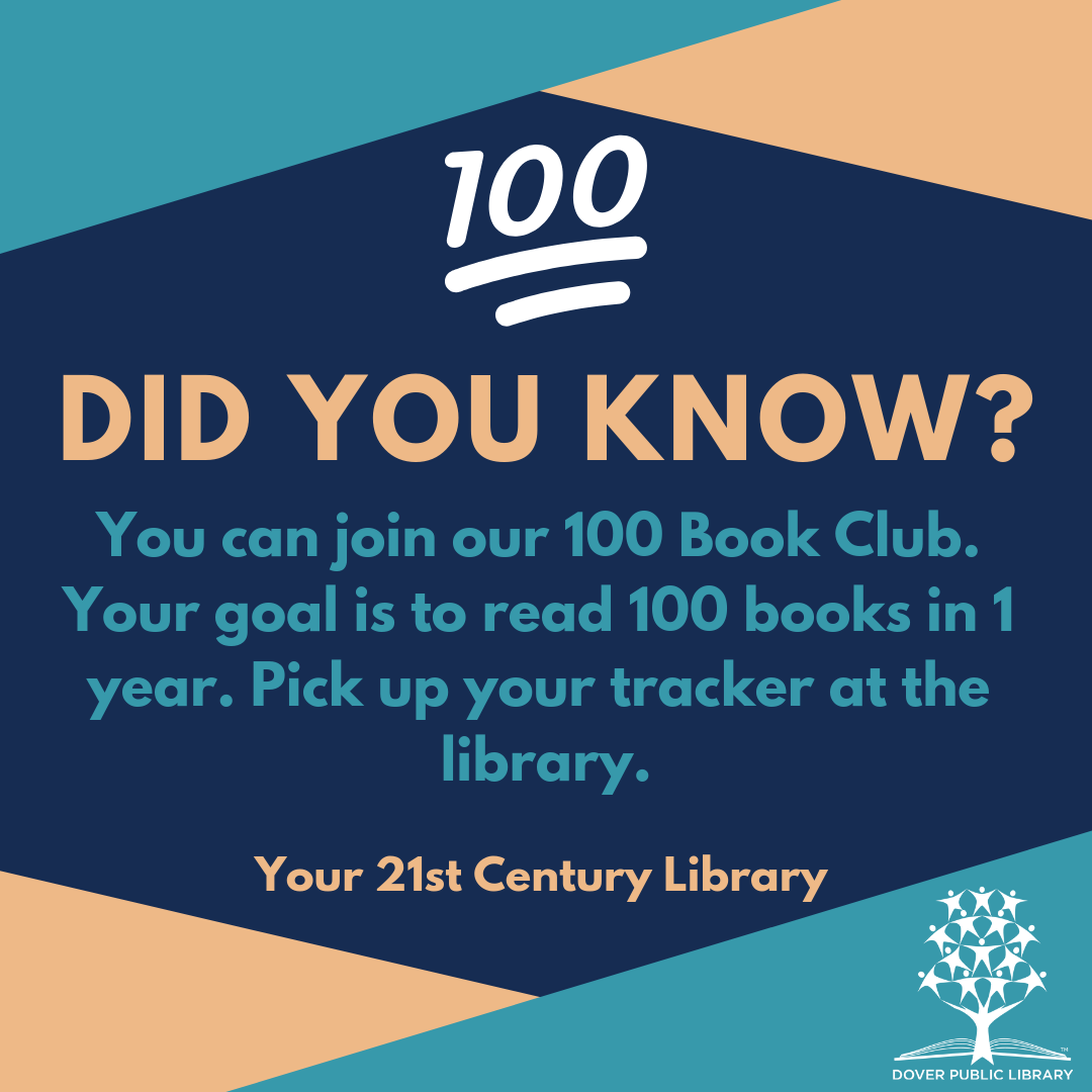
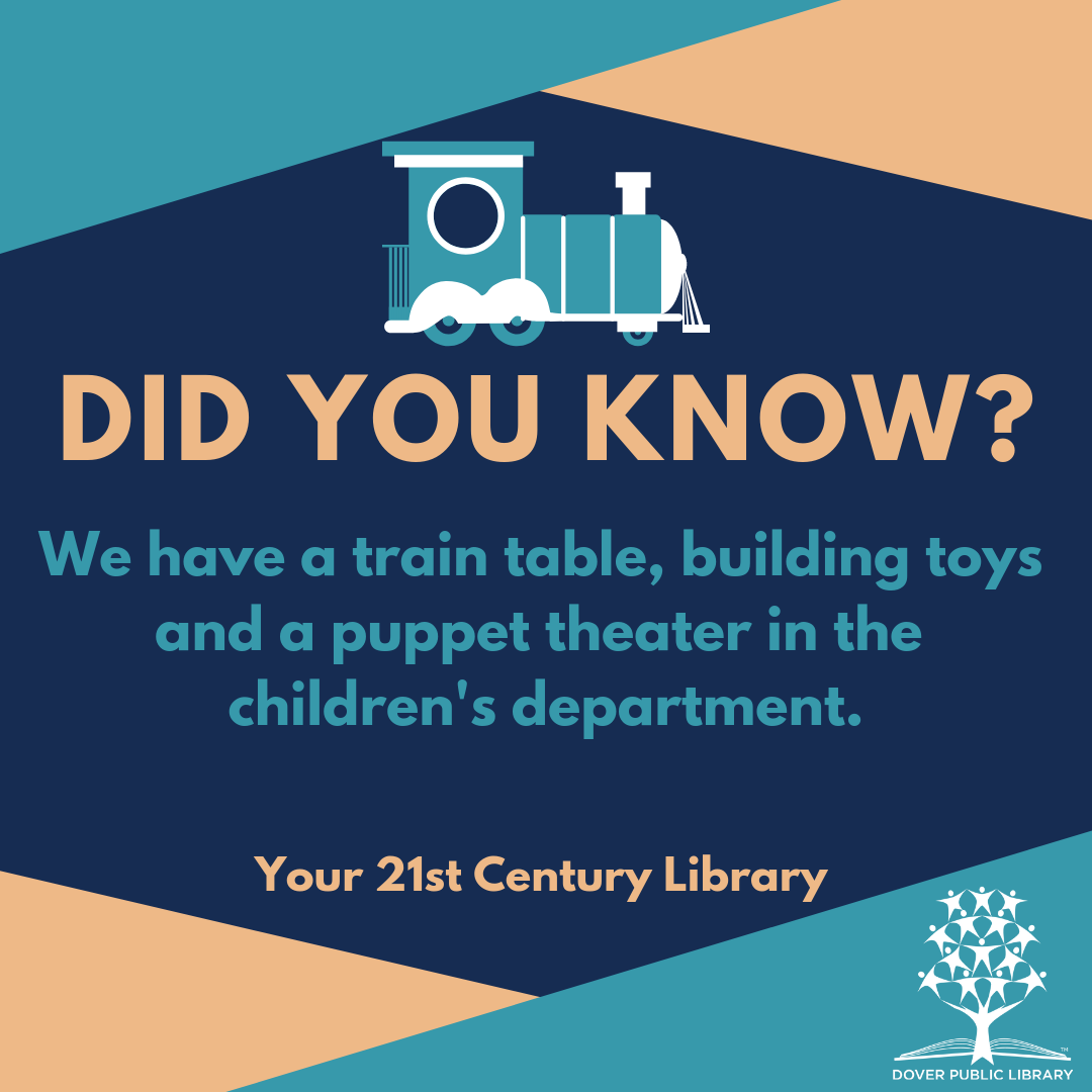
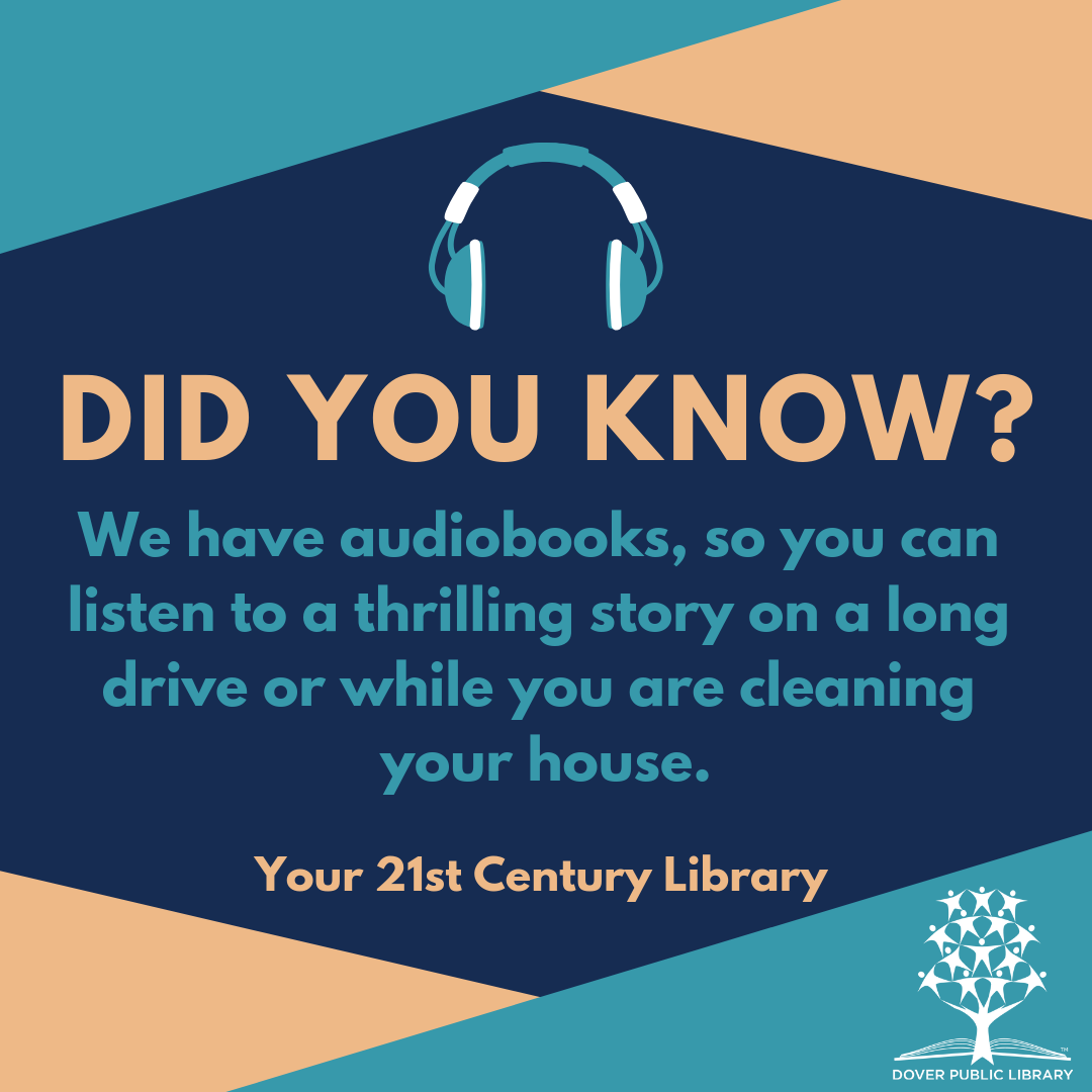
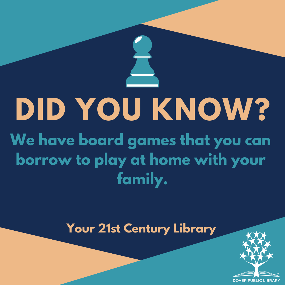
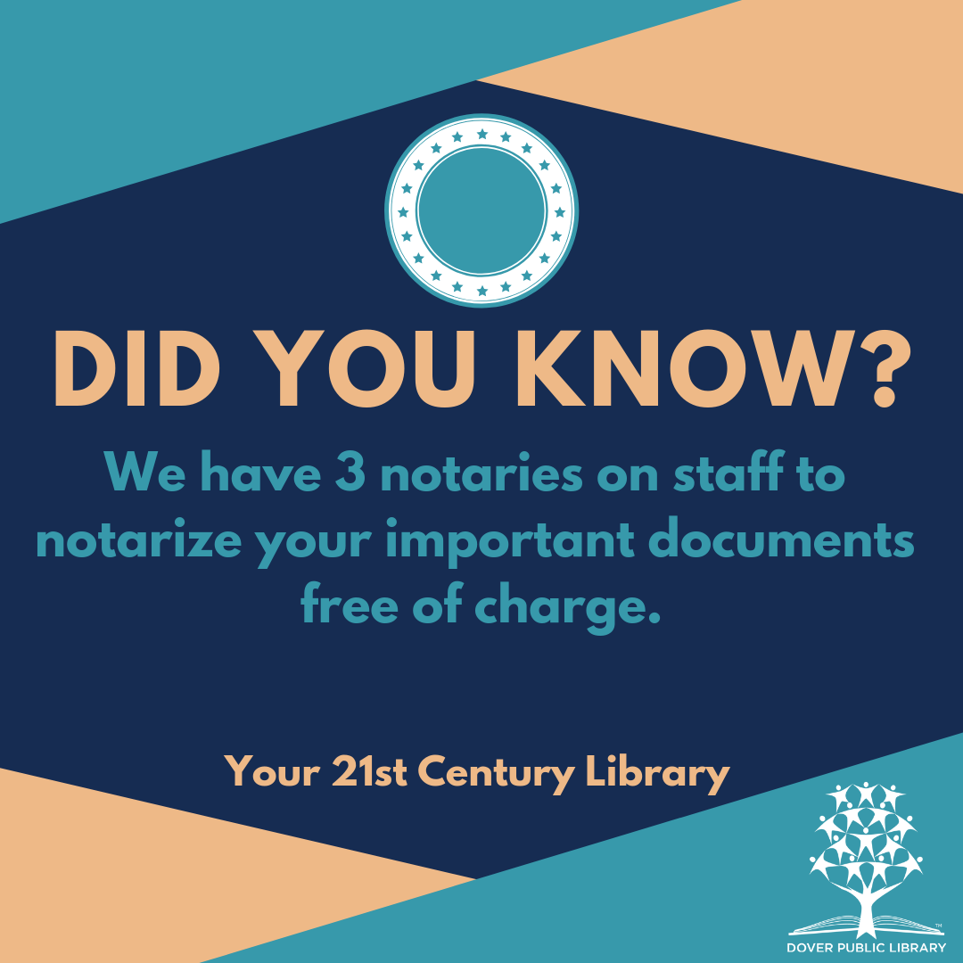
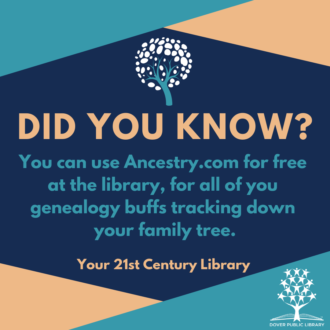
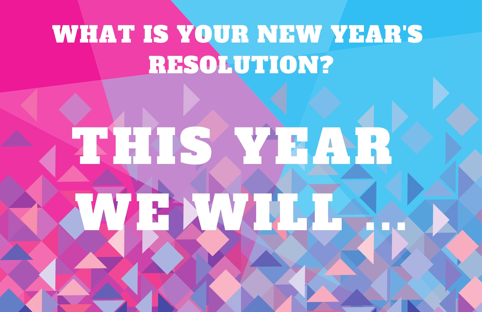
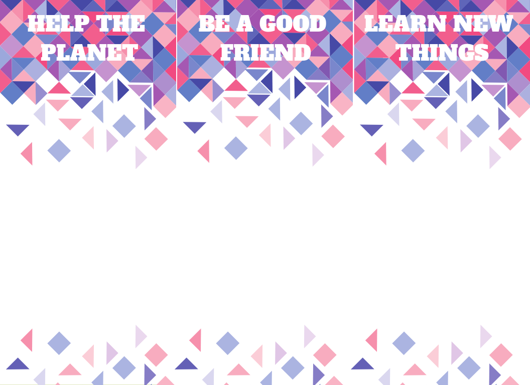
This was also the perfect time to update the public perception of our library. The general perception of the library is : it's the place with all the books. Yup, we are! And so much more. So I made a series of posts about things our patrons might not know about. I used Canva to design these posts and I posted them twice a week on the libraries facebook, in between the book quotes and book spotlights. We had some good responses from people asking questions about the services and tagging their friends in the posts. I have made 34 of these posts so far. You can do this for your library too. Poll your coworkers about services they wish people knew about. Choose a consistent design to transmit the information. One of the great things about Canva is that it has creative templates for you to choose from, or you can design your own template from scratch making it simple to do a repetative task. I also like adding graphic elements from their library because many of them have the option to change the colors. By choosing these adjustable images and changing them all to white and aqua I was able to create a cohesive style. And don't forget your library's logo.   Getting ready for the new year, ticking off my to-do list and battening the hatches for the onslaught of habit reforming resolutions at this special time of year. So tasked with making a book display for the new year I made this display based on a display posted by Librarians vs. Storytime. I always appreciate the cross pollination of ideas in libraries and how librarians are willing to share their great ideas and help each other make amazing programs and services. You are welcome to print this poster and set of bookmarks for your own display.
 There is nothing as satisfying as sitting down with a book and enjoying a delicious cup of tea or coffee. Use these 12 relaxing images on your library's social media accounts (facebook, twitter, instagram etc.) to inspire your patrons to create a moment of comfort and coziness in their fast paces lives. I used a template on Canva and free Creative Commons images both from Canva and Pixabay to create this image set. I made this image set for my beloved Dover Public Library, and post it here to share with you, my fellow librarians.
#librarysocialmedia #hygge #teabook #coffeebook #librarygraphicdesign #readandrelax   A List of online resources that I have found helpful. LearningProgramsImagesColor PalettesFontsVisual Website Builders |

AuthorMallory Thompson, assistant librarian at Dover Public Library and graphic design librarian aka designbrarian. Sharing graphic design relevant to the library with my fellow librarians and book lovers. Archives
September 2019
Categories
All
|
||||||||||||||||||||||||||||||||||||||


 RSS Feed
