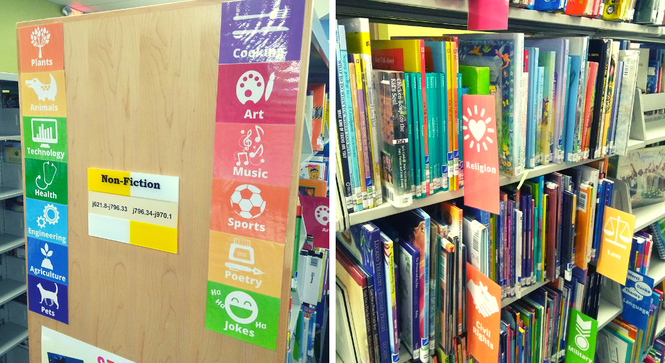
 Did you ever just inwardly groan when you need to find something in the kids non-fiction section. I think it has something to do with the teeny tiny spines that make it difficult to read the call numbers, or the fact that every book is a different size and at least for my department one of the aisles is dark and spooky. Imagine what it is like for a kid to try to find something in all of that. Not fun. So in an effort to make the non-fiction section in the children's department, at Dover Public Library, navigable by young readers and non-readers I made some visual subject signs in a rainbow of colors. We tried to keep it as simple as possible and not make too many signs because that could become just as overwhelming as no signs. I also made smaller matching labels to go on the ends of the shelves.
So what happened after we added the labels? Parents point out the signs to their kids and explain, "See the picture of the dinosaur? That's where the dinosaur books are." We get fewer questions from parents and teachers about where to find books in these general areas and instead get questions on more specific topics. It has also made shelving books in the non-fiction section a lot easier, especially for adult department staff who are less familiar with where everything is in the children's department. And the colorful signs make the spooky aisle feel a little less spooky.

0 Comments
Leave a Reply. |

AuthorMallory Thompson, assistant librarian at Dover Public Library and graphic design librarian aka designbrarian. Sharing graphic design relevant to the library with my fellow librarians and book lovers. Archives
September 2019
Categories
All
|


 RSS Feed
